Visual Vocabulary
The Challenge: Select a “dynamic” word and redesign its letterforms so the style of the font illustrates the word’s definition.
Lesson 1: Concept & Experimentation
Inspiration: Ji Lee – “Word as Image”
Word as Image invites you to see letters beyond their utilitarian dullness. It’s about discovering the magic behind the unique shapes and infinite possibilities of letters and words.


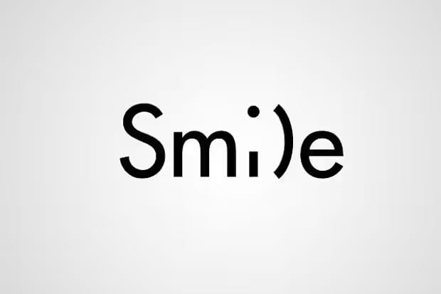


Practical Tasks
Exploring how letterforms can be manipulated.
- Warm-up (10 mins)
On a scrap piece of paper, write the word “Tall” and “Heavy” in a way that represents the word. - The Theory
Remember the Anatomy and Weight
e.g. stretching the “ascenders” (the top parts of letters like ‘t’ or ‘h’) or thickening the base of a letter changes the “vibe.” - Drafting (30 mins)
Choose three words from a list (e.g., Gravity, Melt, Sharp, Echo, Shatter, Expansion). There are some more ‘dynamic’ words below.
Produce three “thumbnail” sketches for each word. - Selection
By the end of Lesson 1, you should have one final “Hero Word” chosen for your polished piece.
20 Dynamic Words
Here is the list of 20 dynamic words, categorised by the “visual energy” they provide. These work great because they offer clear, tangible cues for drawing.
The “Physical Force” Words
- SHATTER (Letters breaking into shards)
- GRAVITY (Letters sagging or piling at the bottom)
- COMPRESS (Squashed, wide, heavy-looking letters)
- EXPAND (Letters growing larger or bursting outwards)
- STRETCH (Tall, thin, or pulled letterforms)
The “Texture & Movement” Words
- MELT (Dripping edges, sagging curves)
- SHARP (Spiky, needle-like points and clean cuts)
- VIBRATE (Double outlines or jagged, fuzzy edges)
- STITCH (Letters made of dashed lines or “sewn” together)
- FLUID (Wave-like, flowing, script-style shapes)
The “Abstract” Words
- ECHO (Fading repetitions of the letters behind the main word)
- GHOST (Very faint outlines or disappearing parts of letters)
- TANGLE (Overlapping letters that weave in and out of each other)
- SLICE (Clean diagonal gaps cutting through the whole word)
- FLOAT (Letters drifting apart at different heights/angles)
The “Environmental” Words
- FREEZE (Cracked textures or icicle-like descenders)
- CRACK (Fractures running through the middle of the strokes)
- BOUNCE (Springy, rounded letters on different baselines)
- HEAVY (Very thick, bold, blocky strokes)
- TALL (Extremely elongated ascenders)
Lesson 2: The Cover Lesson (The Final Outcome)
Note to Cover Teacher: Focused drawing session. Students should aim for high-quality “presentation” standards.
The Task: Create a “Master Study” of your chosen word on a fresh sheet of A4 paper.
Requirements:
- Composition
The word must fill the page. It should be centred and large. - Precision
Use a light pencil to “block out” the skeleton of the letters first. No “bubble writing”—the shapes should be intentional. - Value & Texture
Since it is pencil-only, students must use shading (gradients) and stippling (dots) to create 3D effects or textures.- Example: If the word is “Cold,” maybe the letters have icicles hanging off them with a subtle grey-to-white gradient.
- Example: If the word is “Cold,” maybe the letters have icicles hanging off them with a subtle grey-to-white gradient.
- Refining
Use a sharp pencil to define crisp edges. A dull pencil makes graphics look messy!
Success Criteria for Students
| Feature | What I’m looking for |
| Legibility | Can I still read the word, or is it too “decorated” to see? |
| Creativity | Does the style of the font actually help explain the word? |
| Technical Skill | Is the shading smooth? Are the lines clean and confident? |
| Effort | Is there a clear difference between the rough sketch and this final piece? |
Top Tip for the Cover Teacher
Remind students that negative space (the gaps between letters) is just as important as the letters themselves. If the letters are too close, the word becomes a blob; if they are too far apart, the “visual punch” is lost.