LESS IS MORE

Looking at Jan Tschichold

Jan Tschichold claimed that he was one of the most powerful influences on 20th century typography.
Penguin Books
He spent part of his career with Penguin Books and while he was there he developed a standardized practice for creating the covers for all of the books produced by Penguin.

He personally oversaw the development of more than 500 books between the years 1947-49. Every period of his career has left a lasting impression on how designers think about and use typography, and it will continue to affect them into the future.

He fled to Switzerland during the rise of the Nazi party. His emphasis on new typography and sans-serif typefaces was deemed a threat to the cultural heritage of Germany, which traditionally used Blackletter Typography and the Nazis seized much of his work before he was able to flee the country.

The son of a sign painter and trained in calligraphy, Tschichold began working with typography at a very early age.
Raised in Germany, he worked closely with Paul Renner who designed…

When Tschichold wrote Die Neue Typographie he set forth rules for standardization of practices relating to modern type usage. He condemned all typefaces except for sans-serif types, advocated standardized sizes of paper and set forth guidelines for establishing a typographic hierarchy when using type in design.
Tschichold was Inspired By Constructivism Art
Constructivism art is an artistic movement that originated in Russia in the early 20th century, which emphasized geometric shapes, bold colors, and a focus on functional design. It was primarily concerned with the creation of a new visual language that reflected the revolutionary spirit of the time. In graphic design, Constructivism’s influence can be seen in the use of bold typography, simple and clear imagery, and the incorporation of photography and other modern technologies into designs.


Identify the similarities and differences between Constructivism Art
and Tschichold’s graphic design below


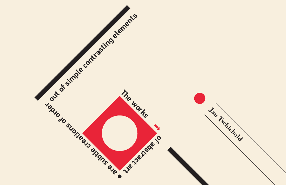
“Great design is just enough and never too much”
Jan Tschichold

CHARACTERISTICS OF TSCHICHOLD
- Grid-based layouts
- Sans-serif typography (often Akzidenz Grotesk)
- Asymmetrical balance
- Strong use of colour (often bold and vibrant)
- Use of photography
- Simplification and clarity
- Influence of Constructivism
- Experimental typography
“Its not what you put in, its what you leave out”
Jan Tschichold

His symbols/logos had to be unified, simple, and memorable
”The liveliness of asymmetry is also an expression of our own movement and that of modern life.”
Asymmetry is the rhythmic expression of fundamental design
Overall, Tschichold’s style is modernist, and structured, and prioritizes clear communication.

“Less
is
more”
TASKS
1. INVESTIGATION INTO JAN TSCHICHOLD
1a. Brief biography of Jan Tschichold
Who is he, what is he best known for?
1b. Analyse Jan Tschichold’s Konstruktivisten, 1937.
Identify and describe the characteristics of his work
– Geometric shapes and use of colour
– Use font, san serif or serif? Describe the style and size
– Asymmetrical balance. Identify both the positive and negative spaces
– Simplification and clarity of the design
1c. How might Tschichold quote help you to design a good graphic piece?
“It’s not what you put in, it what you leave out”
2. CREATIVE BRIEF: GRAPHICS CLASS OF 2023 POSTER
Create a minimalist design poster, inspired by JanTschicholdposter, to promote this graphic design class to the rest of school
POSTER CONTENT
‘Year 9 Graphic Design’
‘2023’
‘Room Number C27’
Class name list
CHARACTERISTICS / SUCCESS CRITERIA
– Grid-based layout
– Sans-serif typography
– Asymmetrical balance
– Strong use of color
– Simplification and clarity
(less is more)
3. EVALUATE