Anatomy of TYPOGRAPHY

Typography is the art of arranging letters and text in a way that makes the copy legible, clear, and visually appealing to the reader. It involves font style, appearance, and structure, which aims to elicit certain emotions and convey specific messages. In short, typography is what brings the text to life.
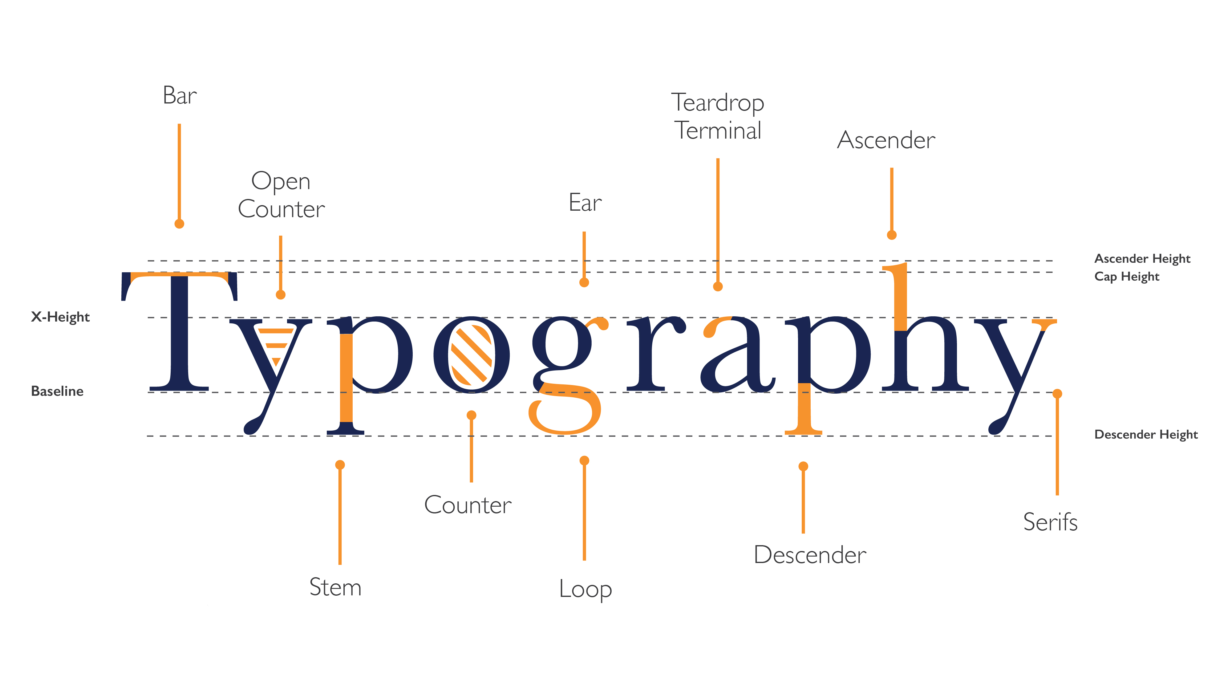
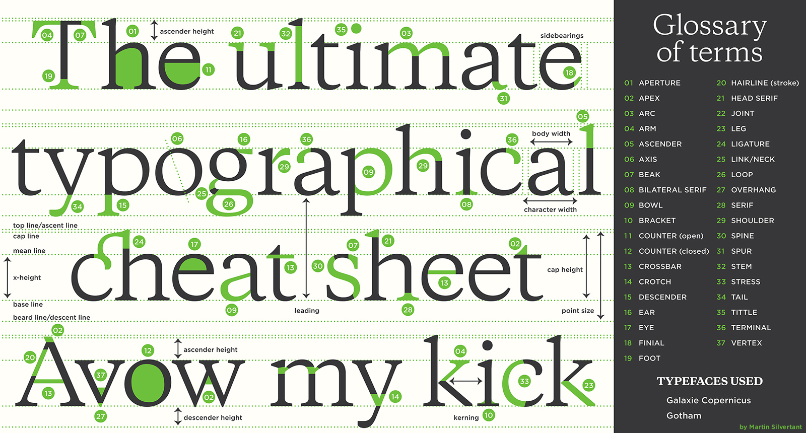
Anatomy of Type
The anatomy of type describes the visual elements that make up the letterforms within a typeface. Each letterform is made up of individual components (e.g., spine, stem, stroke). Type designers create typefaces using components — crucial parts that contribute to the overall appearance and legibility of a typeface.
THE VOICE OF TYPE
If fonts could speak, what would they say? It’s a strange question to ask but essential to consider when faced with thousands of potential designs, and the need to find a font that conveys your message clearly.
“Fonts have a powerful, and instant, visual effect on people. They can be used to speak loudly, softly, playfully, seriously, or in any other voice that you can think of. ”
mono type
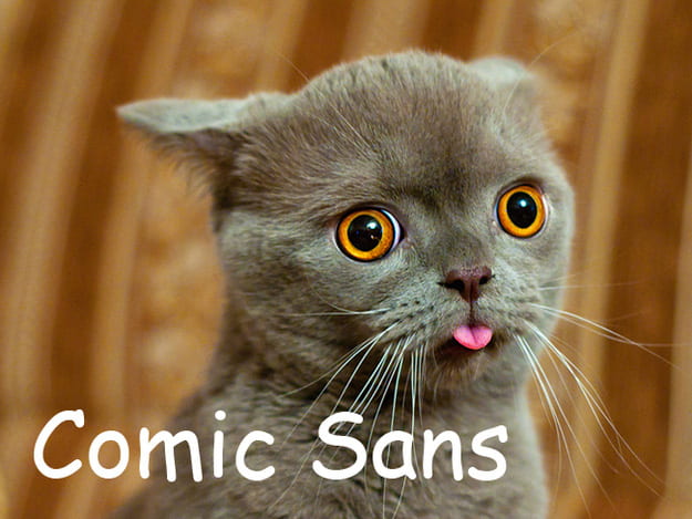
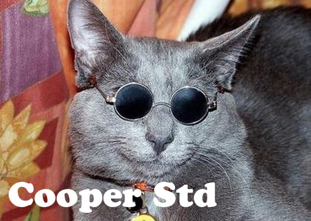
Cats as Fonts


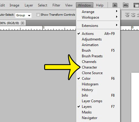
Photoshop – Character Panel
Open Character panel by going to Type Menu → Panels → Type Panel. You can also type Cmd/Ctrl-T to open the window. All sorts of type choices and options become available to you through this window.
For more help with Characters click here


Spell your name without using the correct letters.
LEARNING OBJECTIVES
1. Be able to adjust characters using transformations
2. Apply layer effects and blends to characters
PART 1 – TRANSFORMATIONS
Use the transformation tools to rotate, flip, skew, scale and stretch other letters and numbers to recreate the letters of your name.
Converting and Merging Type


To make your shapes easier to edit (merge the letters, change the colours etc)
To do this you need to right-click on the layers tab on the right of the screen

PART 2. LAYER EFFECTS & LAYER BLENDING

Use the following:
– Layer Effects to add effects to your type using strokes, shadow, glow and bevels.
– Layer Blending is an effect you can add to a layer to change how the colors blend with colors on lower layers.
Normal, Dissolve, Darken, Multiply, Color Burn, Darker Color, Lighten, Screen, Color Dodge, Lighter Color, Overlay, Soft Light, Hard Light, Difference, Exclusion, Hue, Saturation, Color, and Luminosity


TYPOGRAPHY ASSIGNMENTS

1. INTRODUCTION
1a. Create a new page "Typography" and add it to your menu.
1b. Include an introduction explaining your understanding of typography.
- Include images, and videos to help show understanding
2. ANATOMY OF TYPE

2a. Annotate
- Write your name clearly on the worksheet ready to be scanned and upload to your site
- Label “Typography” with the technical words listed

2b - Translate
- Copy “Typography” exactly as shown on the sheet.
- This must be done perfectly. Use the guides. Light pencil, rubber, and ruler.

2c. UPLOAD AND INTRODUCE
- Add a subheading 'ANATOMY OF TYPE'
- Write an introduction explaining the task.
- Upload your worksheet, your work can be found here
3. VOICE OF TYPE

3a. COMPLETE PHOTOSHOP TASK
Each style of lettering has its own very distinctive tone of voice. Different typefaces can express a wide variety of feelings. It is possible to find a font that can SHOUT or whisper a message, or try to attract attention to it.
- On an A4 Photoshop document, create a graphic design that contains the words below.
- You must choose the appropriate font, font style, and font size for each word.
- Experiment with other character adjustment tools e.g. tracking to  S    P   A   C   E  the characters

WORDS TO BE USED AS PART OF YOUR DESIGN
Serif
San Serif
Decorative
Scream
Whisper
Broken
Stretched
Squashed
Spaced
Old fashioned
Celebration
Sad
Happy

3b. UPLOAD & INTRODUCE
- Add a subheading 'Voice of Type' and write an introduction explaining the task.
- Export your work as a jpeg, and upload it to your page your Typography webpage.

3c. EVALUATE
- Pick out a couple of words. How did you reinforce the meaning of the word by choice of font family, style and other character adjustments? Use the appropriate technical words
Font Family: serif, san serif, decorative
Font Style: Bold, italic, lowercase, all caps, underline
Adjustment: kerning, tracking, leading,
Manipulation of word: Size/scale, horizontal/vertical, image fill
4. Spell Your Name

LEARNING OBJECTIVES
1. Be able to adjust characters using transformations
2. Apply layer effects and blends to characters

4a. TASK
Spell your name without using the correct letters.

PART 1 - TRANSFORMATIONS
Use the transformation tools to rotate, flip, skew, scale and stretch other letters and numbers to recreate the letters of your name.

PART 2. LAYER EFFECTS & LAYER BLENDING
Use the following:
- Layer Effects to add effects to your type using strokes, shadow, glow and bevels.
- Layer Blending is an effect you can add to a layer to change how the colors blend with colors on lower layers.

Normal, Dissolve, Darken, Multiply, Color Burn, Darker Color, Lighten, Screen, Color Dodge, Lighter Color, Overlay, Soft Light, Hard Light, Difference, Exclusion, Hue, Saturation, Color, and Luminosity

4. RECORD
4a. Save and export to your typography webpage.
4. Include a subheading - 'Spell Your Name'
4b. Label and explain how you used character adjustment tools and layer blending effects to complete
the ‘Spell Your Name’ activity.