Typography Mind Map

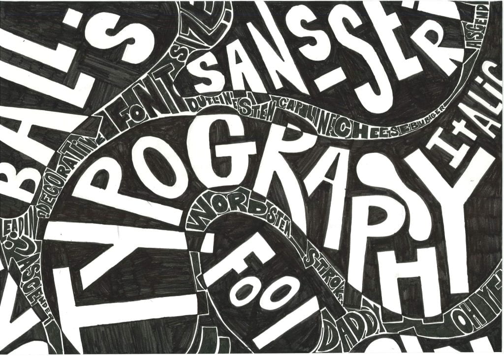
INSPIRATION

How would you describe Dominic McGill’s work?

Dominic McGill’s works wear extensive research on their sleeves. Using surfaces that range from wall-height enclosures to resin and gesso sculpture in intestinal loops and folds, his drawings combine collaged elements, drawn imagery, and, above all, a wild profusion of text deriving from a range of sources.

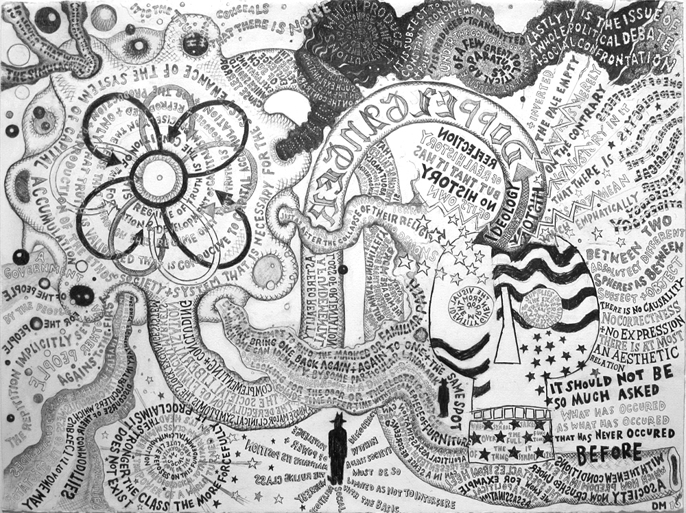
Architectural in scale, McGill’s works envelop the viewer, generating an overwhelming sense of unbridled celebration, as images beget text and vice versa. We’re in the eye of the brainstorm.
MEET MR DOODLE
He likes to doodle.


Characteristics of McGill and Mr Doodle
(future assignment success criteria)
MEDIA
Black pen on white paper
VISUAL ELEMENTS
– Organic, freeform lines and shapes
– Contrast in tone (light and dark areas) outline only, block fill, inverted method
COMPOSITION
– Dynamic composition (content spills off the page)
– interesting spaces – your design will have a balance
– Awareness of negative spaces when adding shapes (taper lines/letters)
TYPOGRAPHY
– Variety of free-form typefaces (serif, san serif, block capitals, decorative)
– Font style – (outlined, block filled)
– alignment to other elements, characters and words should not touch?
– Contrast in scale (big/small words)
Artist Research - Who is Dominic McGill?
1. Create a new webpage 'Typography'
2. Include a subheading 'Typography Mind map'
3. Who is Dominic McGill and what is he best known for?
4. Include a sample gallery of his mind map artworks
5. How would you describe Dominic McGill’s work?
6. What inspiration will you takeaway and apply to your Typography mind map?
McGill Inspired
Typography Mind Map
ASSIGNMENT BRIEF: On A4 cartridge paper, create a hand-drawn Dominic McGill inspired mind map using words related to Typography.
THE PROCESS / SUCCESS CRITERIA
Know and understand the success criteria. It is important you follow the steps exactly. You will reflect on these in your midway review and final outcome
1. TAPER LINES & SPACE

SUCCESS CRITERIA
– Using a light pencil and a rubber (you will rework your design)
– Draw taper lines to break up the page and create interesting positive and negative spaces, which you will add in words into and around.
– Ensure your taper line are elongated so you can write long words. Lots of square shapes will not help you
2. ADDING TYPOGRAPHY

SUCCESS CRITERIA
– San Serif, block writing will work best
– Stretch and squeeze your typography to fit within the tapper lines
– Alignment to other elements – words should never touch
– Use Dynamic Composition, allow your words to spill of the page
– Rework your tapper lines as you go.
– A good design should have contrast, big words next to small words
– Consider how you write each word. How might you reinforce what the word means e.g. BOLD
KEYWORDS YOU MIGHT USE AS PART OF YOUR DESIGN
Typography
Typeface
Character
Font style
Sans-serif
Serif
Decorative
Script
Italic
Condensed bold
Stroke
Stem
Foot
Descender
Ascender
Baseline
Cap line
Kerning
Leading
Tracking
Horizontally scale
Vertically scale
Outline
Block fill

Where kerning involves the spacing between two letters, tracking involves the spacing throughout the entire word.
What is going well?
What can be improved?


3. BLACK OUTLINE – BEFORE SELECTIVE FILL
SUCCESS CRITERIA

– Each letter/word should not touch. You want to reveal white channels breaking up the words. If you don’t it could look messy.
– Don’t add a pen to the taper lines, these will be rubbed out later
– When using the black pen add the outline first
– Choose to fill either the positive (type) or the negative space (space around the type)
– Then adding the fill consider the balance and weighting e.g. don’t fill all the words on one side
– You could try the split inverted technique
– Rubout any remaining pencil
– Hand in work ready to be scanned for your webpage
What is going well?
What can be improved?


4. MIDWAY REVIEW HOMEWORK
Using the step/success criteria, how well is your design going? What might you need to do to improve?
Your work can be found here


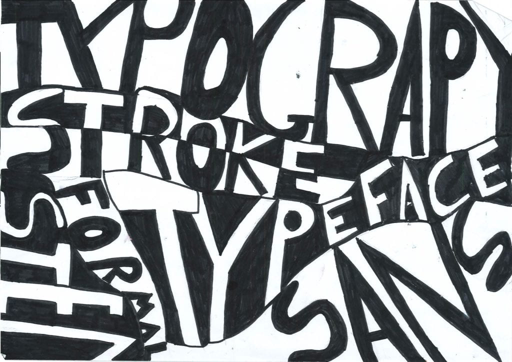
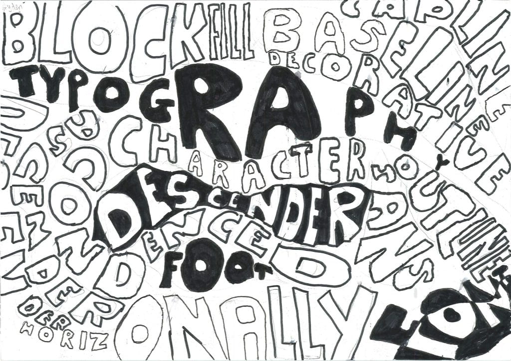
Finished Examples
2025-26


2025


2024-22



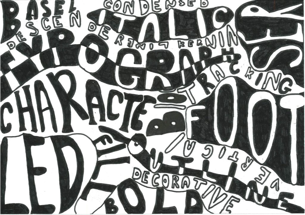


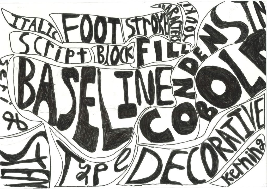

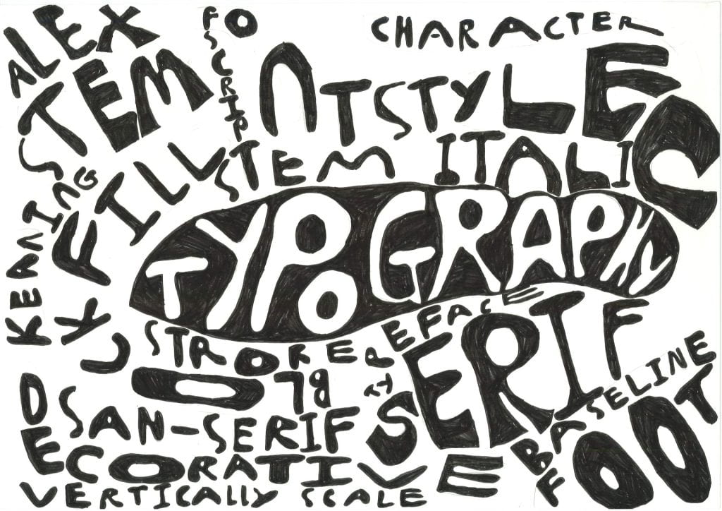


EVALUATION
Upload your final outcome to your webpage. Use the guide below to help structure your reflection.

INTRIODUCTION
- What did you make? What is your Typography Mindmap about?
- What parts do you think are well designed?

VISUAL ELEMENTS
- Did you use interesting lines and shapes?
- Are your lines and shapes freeform and flowing? Do they help lead the viewer’s eye?
- Did you show contrast in tone? Have you used light and dark areas?
- Did you try different effects like outline only, block fill, or inverted?

COMPOSITION
- Is your layout dynamic and balanced?
- Does your design feel like it spills off the page or fill the space well?
- Does your layout feel balanced with no large empty gaps?
- Did you think about negative space? Are the empty spaces between shapes and letters interesting?
- Did you taper lines or letters to add movement?

TYPOGRAPHY
- Did you include different types of fonts (serif, sans serif, decorative)?
- Did you try out styles like outline, block fill, big and small words?
- Do the words touch or align with other shapes?
- Have you thought about how the words are placed?

REFLECTION
- What new skills did you learn?
- What did you learn about typography?
- What techniques did you enjoy or improve on?
- What would you do differently next time?