Typeface Poster

The objective of this lesson is to appreciate, differentiate and use different
typefaces to create a beautiful design
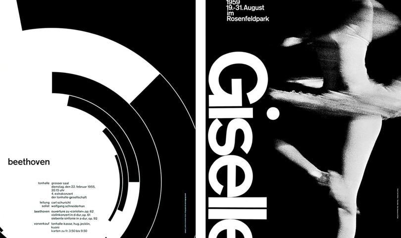
Typography is the art of arranging letters and text in a way that makes the copy legible, clear, and visually appealing to the reader. It involves font style, appearance, and structure, which aims to elicit certain emotions and convey specific messages. In short, typography is what brings the text to life.

Garamond is a group of many serif typefaces, named for sixteenth-century Parisian engraver Claude Garamond, generally spelled as Garamont in his lifetime. Garamond-style typefaces are popular and particularly often used for book printing and body text.

Garamond Typeface Posters


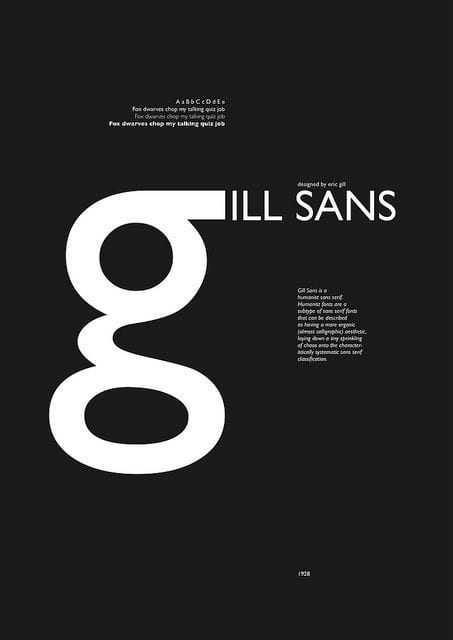
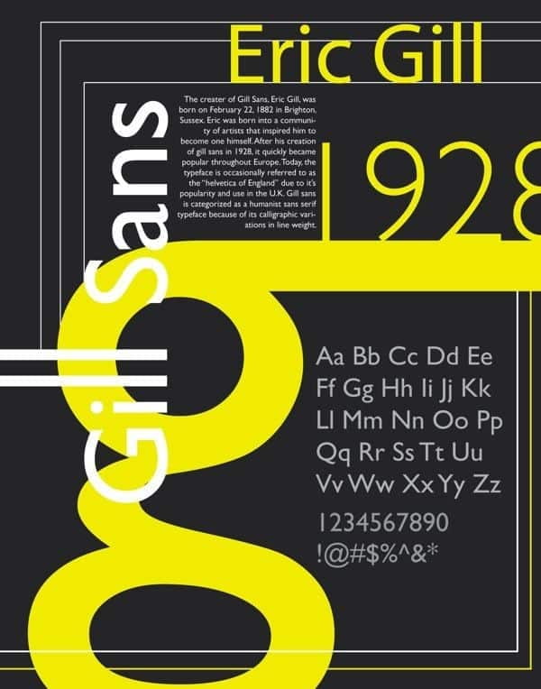
Gill Sans is a humanist sans-serif typeface designed by Eric Gill and released by the British branch of Monotype from 1928 onwards. Gill Sans is based on Edward Johnston’s 1916 “Underground Alphabet”, the corporate font of London Underground. More can be found here

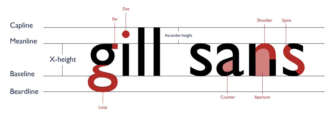
Gill Sans Typeface Posters




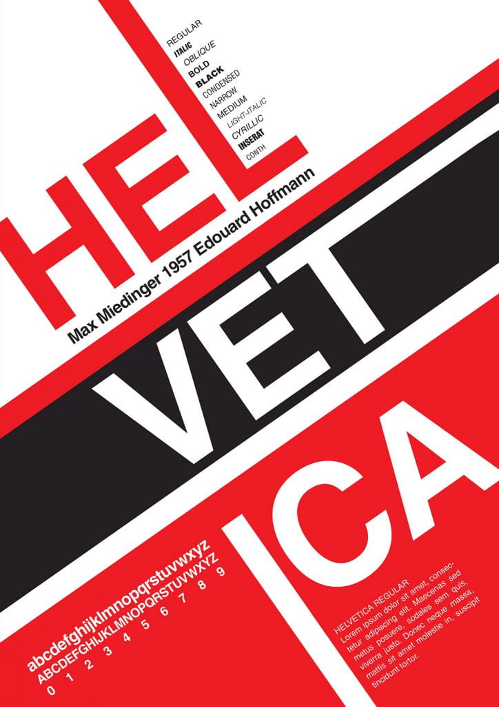
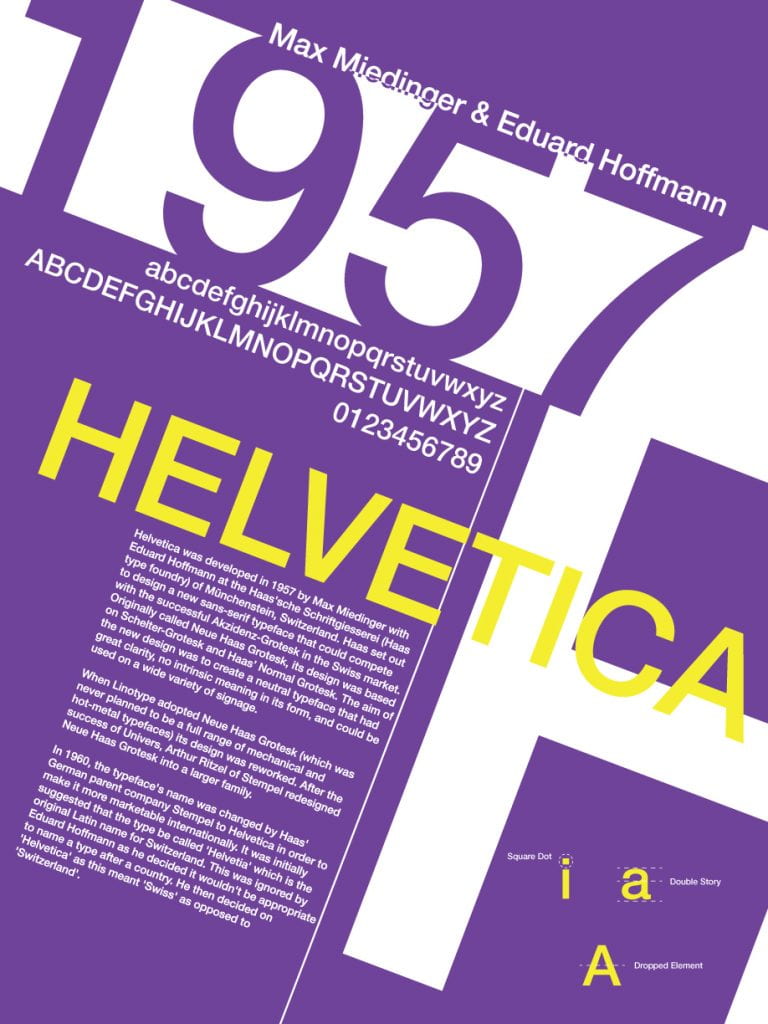
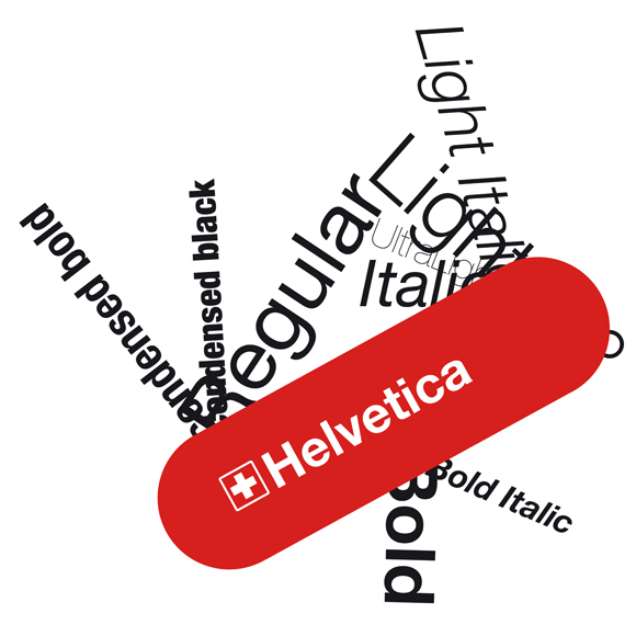
Helvetica, also known by its original name Neue Haas Grotesk, is a widely used sans-serif typeface developed in 1957 by Swiss typeface designer Max Miedinger and Eduard Hoffmann.

Feature Length Trailer
Helvetica Typeface Posters




Balance’ Design principle of Graphic Design
ASSIGNMENT
1. INTRODUCTION
– Create a subheading “Typeface Poster”
– Choose a typeface
– Find out some information about your chosen typeface. Include images and videos to back up your understanding
This will be used as content for your typeface poster
2. CREATE A TYPEFACE POSTER
– Create a stylish, minimalist poster for Garamond, Helvetica and Gill Sans typeface.
– You can only use THE typeface.
– No other typefaces or images.
CONTENT OF POSTER
– Name of the typeface.
– the typographer (type designer)
– other relevant/interesting historic information
– examples of letters, numbers, uppercase, lowercase, and font styles
POSTER DESIGN
– Be inspired by the typeface posters, what did you take away from looking at these designs?
SUCCESS CRITERIA
A good design will include:

Contrast
- in scale and tone
Range of font styles
- italic, bold, extra bold, condensed bold, light, ultra-light…
Dynamic Composition
- allowing elements to spill off the page
(this creates interesting spaces to place other design elements)
- placing elements on a diagonal
Type as a shape
- and the negative space around it
Alignment to other elements
- a good design has a balance
Typeface Poster 2
– Choose another typeface.
– Complete your second poster design
3. EVALUATION
3a. Based on the brief, how successful is your outcome?
3b. Describe the steps taken to achieve the finished piece.
Explain how you refined your design over time. What decisions did you make?
3c. Is it aesthetically pleasing? Consider the structure:
– Composition (the arrangement/layout of the piece, is it off-centre?)
– Diagonal/vertical/horizontal lines
– Form (what is the shape of the key objects in the image?)
– Layers (building it up, in Photoshop)
– Sections (different parts, is it broken up or merged together?)
3d. Too much or not enough?
– What is missing?
– What could be removed?