SWISS STYLE and GRID SYSTEMS
Create a Swiss design inspired gig poster for your favourite musician/band. Your design can only contain TYPOGRAPHY and GRAPHIC SHAPES. Apply your knowledge and skills to this design project. Reflect on the process of designing and pairing image and typography
Jump to Guides
Jump to Assignments
Swiss Style Design

Often referred to as the International Typographic Style or the International Style, the style of design that originated in Switzerland in the 1940s and 50s was the basis of much of the development of graphic design during the mid 20th century. Led by designers Josef Müller-Brockmann at the Zurich School of Arts and Krafts and Armin Hofmann at the Basel School of Design, the style favored simplicity, legibility and objectivity.
Of the many contributions to develop from the two schools were the use of, sans-serif typography, grids and asymmetrical layouts.
Also stressed was the combination of typography and photography as a means of visual communication. The primary influential works were developed as posters, which were seen to be the most effective means of communication.
Inspiration Weekly: Swiss Design

Characteristics of the Swiss style are:
Overall Design
Clean, minimalist, impactful design
Use of modular grid
– Design elements have been arranged according to the modular grid to govern layout decisions.
– Dominance and emphasis have been given to oversized typography (contrast in scale) giving the final design an asymmetrical look to the design.
– Dynamic composition with larger elements spilling off the page.
Typeface
– Sans-serif typeface
– Bold font style
Justification of type
– Flush left, ragged right text
Shape
– Geometric graphic shapes
Colours
– Bold, block colours
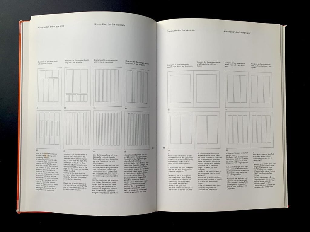
Poster designs from the 1950s and 60s by Joseph Müller-Brockmann, demonstrating modular, rotated, and even radial grids.


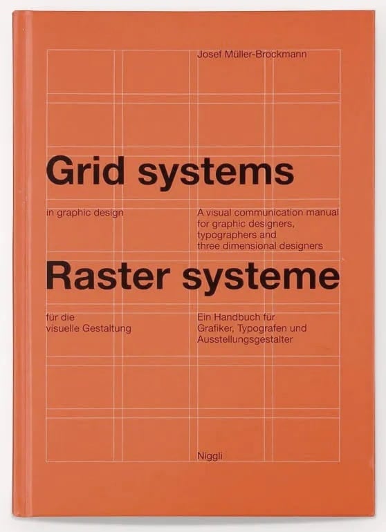
Josef Müller-Brockmann
Müller-Brockmann in particular-one of the main exponents of the “Swiss Style”-pushed the limits of grids by creating modular and rotated grid systems. He published a detailed handbook (essential reading for any graphic designer) called Grid Systems in Graphic Design, and it represents a collation of the insights gained through his illustrious career.
As well as explaining the history of much typographical terminology, he discusses in depth how to choose margin widths that are both visually interesting and functional, and covers tricky details like how to place page numbers in relation to the grid.


GRID SYSTEMS
In graphic design, a grid is a structure (usually two-dimensional) made up of a series of intersecting straight (vertical, horizontal, and angular) or curved lines (grid lines) used to structure content.
History of grid systems in graphic design here
Grids Systems (Alignment)
A grid can create an invisible structure on which visual elements can be placed on. These grids can ensure accurate alignment and consistency in a large piece of design work.
COLUMN GRIDS
This is the most common type of grid used by graphic and web designers. It involves taking a page and splitting it into a number of vertical fields, which objects are then aligned to. Newspapers and magazines use column grids extensively.


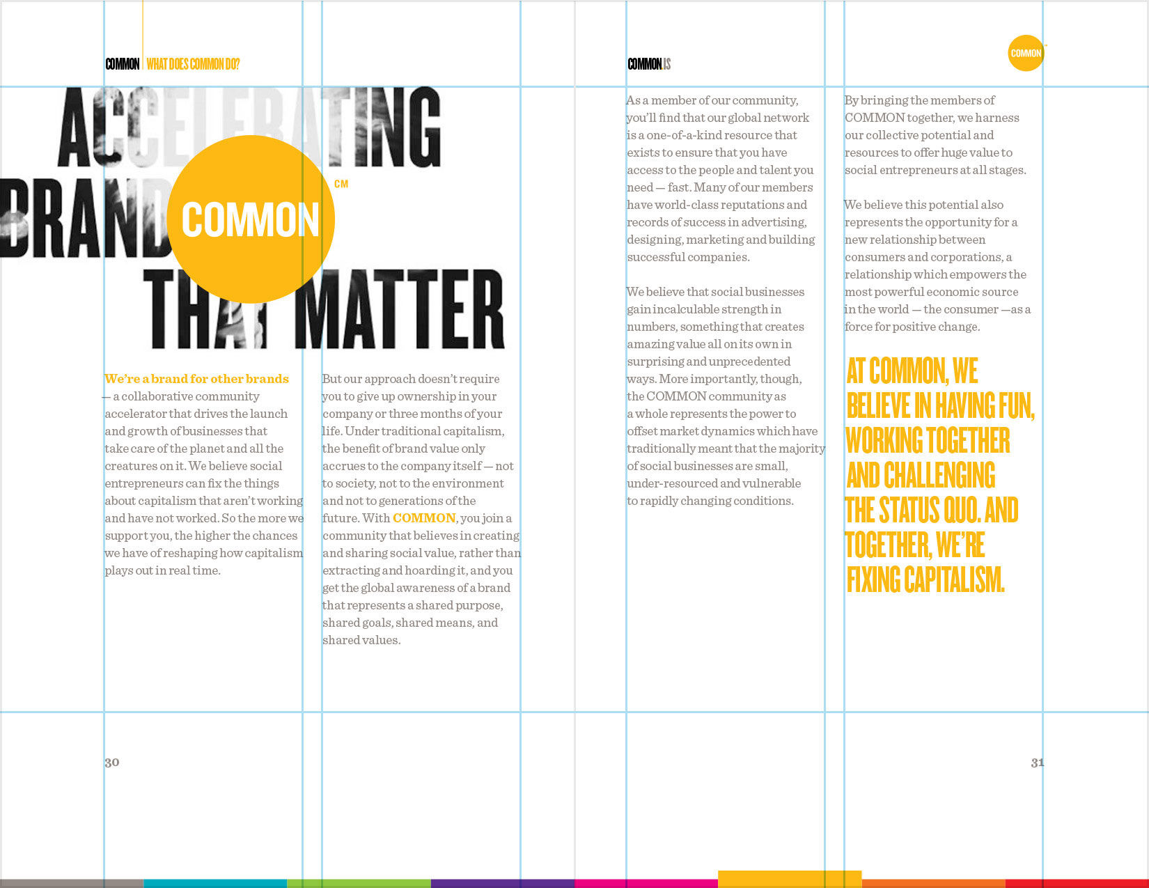
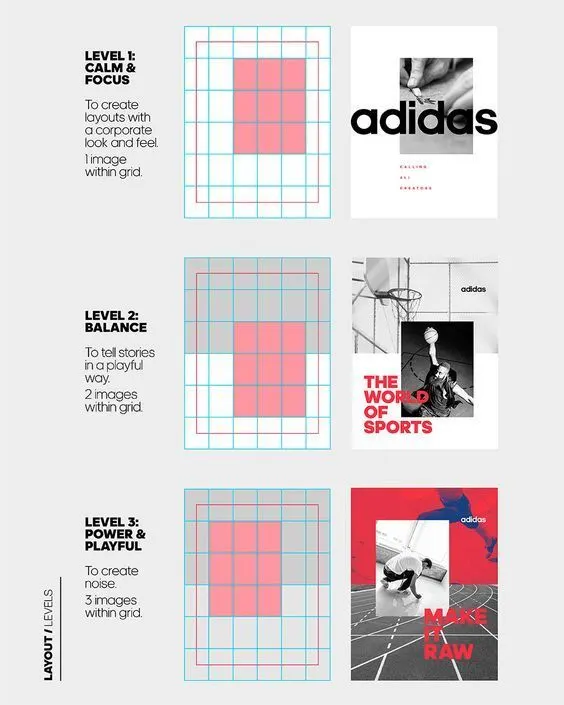
MODULAR GRID
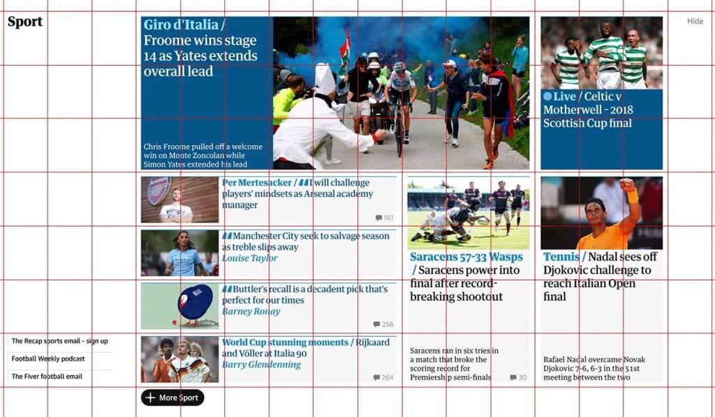
Kind of an extension of the column grid, a modular grid involves taking a column grid and adding rows to it. The intersecting rows and columns create “modules” that can then be used to govern layout decisions. Magazines and corporate reports often use modular grids.

An incredible number of possibilities are created through the modular system can be seen in much graphic and web design today. For example, we can see a digital version of modular system at work on the Guardian’s website

Learning How to Use Grids for Poster Design
When designing a poster, starting with a blank canvas can often be bewildering, but if we start with a grid, it can help give us a framework to help layout our visual elements. If you sometimes struggle with your design and want more ideas and inspiration, then this may be the video for you!
This video is going to be really important for those of you who want to improve on your layouts and learn about grids and how you can use them in your design. This video explains grids and the various grids you can consider using in the context of poster design, but these grids can be used in any layout design you wish to create.
SWISSTED DESIGN
Swissted takes rock concert posters of the ’70s, ’80s, and ’90s and remixes and reimagines them through a Swiss modernist lens. You see the website here


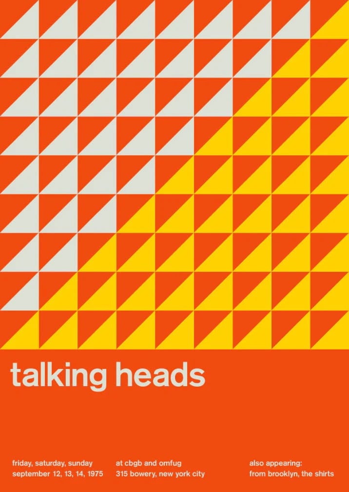
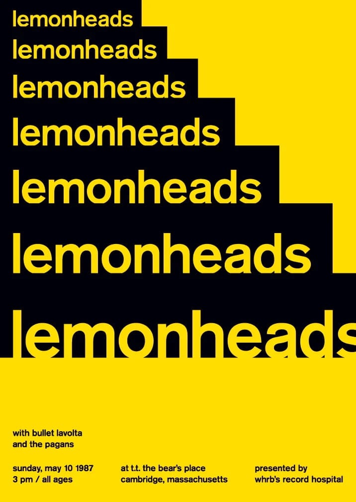
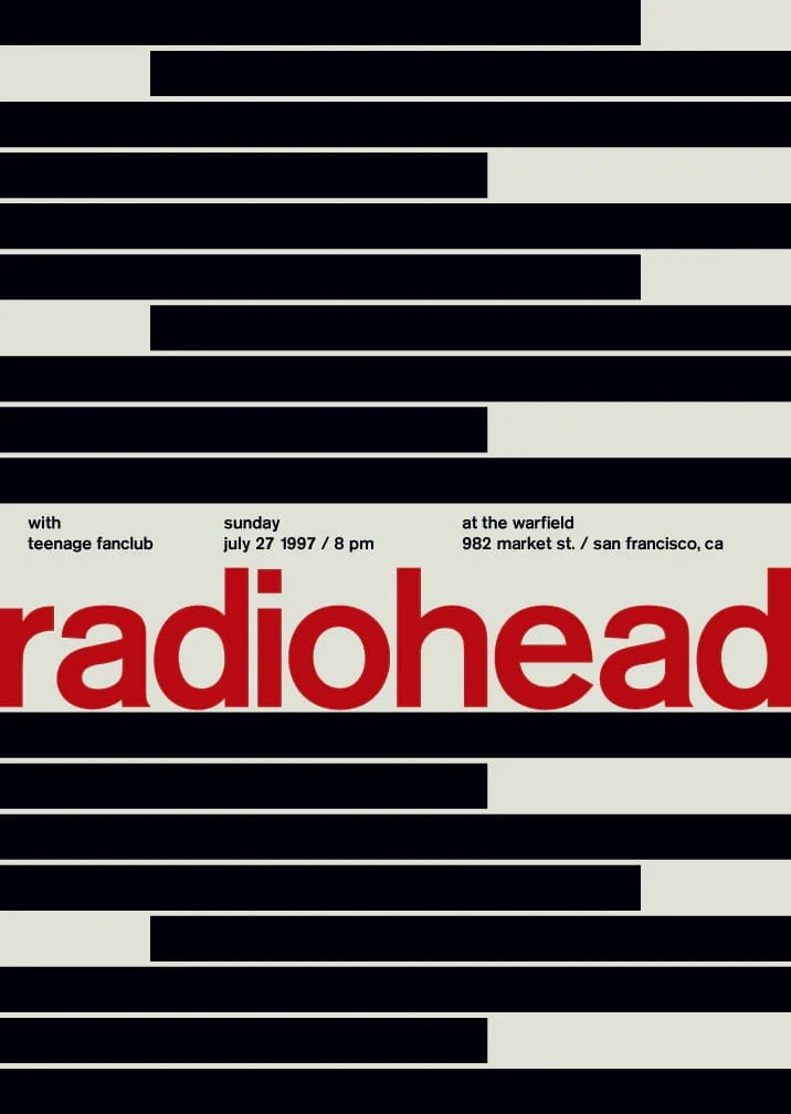
What are the characteristics of the Swiss Style design when looking at this design?
THINK ABOUT
– How would you describe to overall feel/look of the poster?
– How have they used a modular grid for layout and arrangement? How balanced is the design – is it symmetrical or asymmetrical?
– What kind of typeface and font style has been used?
– Justification, and alignment of type
– Use of shapes
– Colour scheme
ASSIGNMENTS
INTRODUCTION
1. Create a new webpage "Swiss Design"
2. What is your understanding of Swiss Design and the grid system?
3. Include examples of Josef Müller-Brockmann work
4. Include your C27 Room Sign and your name experiments
5.  Highlight some of the characteristics of Swiss Design in your work
Creative Brief 1: C27 Door Sign

Objective: Design a clean, minimalist sign for the classroom door that adheres to Swiss design principles.
Instructions:
Asymmetrical Layouts: Arrange elements (text, shapes) in a non-central, dynamic way.
Use of a Grid: Use a grid system to ensure alignment and structure.
Sans-Serif Typefaces: Choose a simple, sans-serif font for clarity and modernity.
Graphic Shapes: Add graphic shapes to add more interest to your design
Text Alignment: Align text flush left and ragged right.
Bold and Impactful: Ensure the sign is bold and easily readable from a distance.

Content:
The following information can be included on the poster. Remember to use hierarchy!
- C27
- Computer Room, ICT Suite
- Rules or Reminders
(minimalist phrasing like: “No Food or Drink”, “Log Out After Use”, "Chairs Under Tables", "Do not remove keyboards and mice")

Steps:
Create your design using Photoshop.
Apply the grid to align your text and any additional elements.
Choose a sans-serif font and make sure your text alignment is flush left, ragged right.
Use minimal colours and shapes to maintain a clean look.
Present your final design on your website
Creative Brief 2: “Swiss Style Name Art”
Objective:
Design your name in the Swiss Design Style using Photoshop. Focus on clean typography, bold colours, and geometric shapes to create a striking, minimalist composition.
Choose a design from the Swissted book and copy it!
Key Rules:
- Typography: Use a sans-serif font (e.g., Helvetica, Arial, or Futura).
- Colour: Stick to 2-3 bold colours (e.g., red, black, and white).
- Layout: Align your name to a grid for precision.
- Style: Keep it minimal—no clutter, just clarity!
Steps:
- Open Photoshop and create a new document (A4 or square).
- Type your name in a sans-serif font.
- Experiment with:
- Size and spacing (make it bold or stretch it out).
- Colour blocks (add shapes or lines behind/around your name).
- Alignment (try centring or off-centre layouts).
- Save your design as a JPEG or PNG.
Student Examples


Creative Brief 3: SWISS-INSPIRED GIG POSTER
Create a Swiss Design inspired gig poster for your favourite musician/band/DJ.
Your design should only contain TYPOGRAPHY and GRAPHIC SHAPES.

SWISS DESIGN PRINCIPALS / SUCCESS CRITERIA
- Clean, minimalist, bold impactful
- Asymmetrical layouts
- Use of a grid (alignment)
- Sans-serif typefaces
- Flush left, ragged right text

PLANNING
Consider the genre of music (rock, pop, hip-hop, drum and bass, country) and how your choice of typography, colour and design might visually describe the music

POSTER CONTENT
- Name of artist
- Venue Name
- Address
- Date
- Time

Example
‘Brixton Academy’
‘211 Stockwell Rd, London SW9 9SL’
‘July 10th 2022’
‘DOORS 8PM’
Homework
Upload your final outcome to to your webpage.

Reflection Questions – Swiss Design Poster
What message or mood were you trying to communicate about the artist or band?
How did you use Swiss design principles like grid, alignment, and simplicity in your poster?
How did you choose and use typography to reflect the style of the music?
How did you use shapes and layout to create visual interest and balance?
What worked well in your final design, and what would you improve next time?
Photoshop Guides
PHOTOSHOP TOOLS
Ruler – “ctrl r”
Type tool – “t”
Move tool “v”
Shape “u”
Duplicate – cntrl/cmd + j
Blending Options – FX


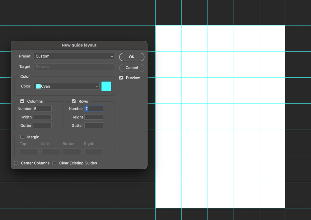
How to create a 5×7 grid
View > New Grid Layout
Gutter = 0
CREATIVE ASSIGNMENT 3
Sports Day


